Strategic Travel Managers Know Chemistry

Imagine a dashboard that could show you how much carbon dioxide your travelers generate every day. It’s actually a straight-forward problem and one I’ll try to solve for you today. Information about aviation fuel economy isn’t very accessible, but there are good clues and accurate data is easy to capture. Your frequent flyer account will keep track of the miles you’ve flown, but it’s impossible for most people to connect the dots to determine what their trips cost. Not in dollars, but in fuel, or in CO2 emissions. In a previous article I calculated “mileage” rates for aircraft by cabin and type of plane (single aisle or twin aisle) “The Secret Behind Airline Fuel Surcharges.”

In this report I’ll show you how much Carbon Dioxide a particular flight created and give you a quick, easy-to-use grid to provide travelers with information about the carbon footprint their choices make.

No need to remember anything about High School chemistry since I’ll lay out the chemistry and math to solve this problem.

First, Jet Fuel, or Jet A, contains a blend of different carbon-based molecules that combine with Oxygen to generate heat and pressure that jet engines convert to thrust. For simplicity, I’ll ignore the blend, and assume that “Octane”, a string-like molecule that contains a backbone with eight carbon atoms, and eighteen Hydrogen atoms along the sides and endcaps, is a good proxy for everything else in the gas tank. During the combustion reaction, each carbon atom combines with two Oxygen atoms to form Carbon Dioxide (CO2), while Hydrogen will also combine with Oxygen, but their marriage yields water (H20). The reaction balances when two Octane molecules react with twenty-five Oxygen molecules (O2) which contain two Oxygen atoms captured from the air passing through the engine. The exhaust product contains sixteen Carbon Dioxide molecules and eighteen water molecules. Here’s the equation: 2 C8H18 + 25 O2 -> 16 CO2 +18 H20.

This detail isn’t useful until we convert molecular weights and ratios into terms that people are more familiar with. In this case, jet fuel weighs about 6.5lbs per gallon, and that mass is 81% carbon. We already know that our Octane molecule will split to form water and CO2, but the result most people struggle with is the conversion to weight. Specifically, Oxygen is heavy, about a third heavier than Carbon, so when each Carbon atom combines with two Oxygen atoms, the resulting molecule, CO2 is four times heavier than the Carbon atom by itself. This means each gallon of jet fuel (6.5lbs) carried by the aircraft will combine with 23lbs of Oxygen from the air during the journey and turn into twenty pounds of CO2, and just over nine pounds of water!

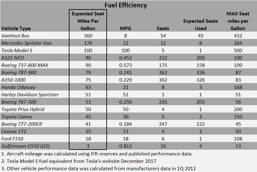
How much CO2 does a Boeing 777-200 create on a flight between Chicago and Hong Kong? Let’s work through it – fuel is a liquid, and measured in gallons, but the exhaust is a gas, that’s why we use weight rather than volume to describe the output. I calculated the 777-200’s gas mileage in a previous post here. At .1836 miles per gallon, a 7,821 mile flight needs 42,000 gallons. The flight would generate 851,000lbs of CO2. That’s 30% more than the maximum takeoff weight on departure, including the plane, fuel, passengers and cargo. The table below contains a comparison among cabins and shows passengers, fuel burn and CO2 emissions.

CO2 per flight

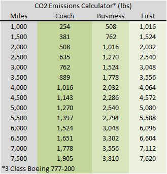
Now that you have information about how to calculate the CO2 emissions for an entire flight, we need to add more information to break this down to the seat level. Previously I calculated the fuel burn per seat to provide a table that shows how much the fuel costs per mile for each cabin and at various price points for fuel. That’s a good starting point, but this time the data table will display how much CO2 an international flight would create for different distances and cabin. See below.

C02 per seat 777-200

The Boeing 777-200 offers a useful snapshot of the likely performance other aircraft could achieve. It’s a good benchmark because it’s currently in production and it’s flown on transatlantic, transpacific and intra-Asia flights.  However, the design requirements for long-haul international flying require twin aisles, more lavatories, large galleys, more storage space, life rafts and a host of other overhead not needed for shorter hops. These factors make it useful to perform a similar calculation to offer information about CO2 production from more efficient single aisle aircraft in use on short hauls and for domestic US flying. In this case, the 189 seat, all coach, 737-800.

CO2 per flight 737

A comparison between the 737 and 777 coach emissions level demonstrate that the smaller aircraft is more than 55% more fuel efficient when using numbers normalized for total seats. When you measure efficiency on a blended basis across all cabins the total difference is higher, that’s why it’s important to have separate tables. These tables offer you a quick resource to answer questions about the carbon footprint your travelers leave behind each trip. For more information about aircraft efficiency and comparisons among different modes of transportation, check out these posts about commercial aircraft fuel economy:

The Secret Behind Airline Fuel Surcharges

Boeing 737 vs. Toyota Prius (this might surprise you)

Aviation Travel Management

You Won’t Believe This About Southwest Airlines.

You won’t believe this. I didn’t, and I’ve spent more than a decade staring at airline industry data, so maybe I’m the only one who didn’t see it coming. I’m going to show you something that runs counter to conventional wisdom and what we know and hear about at every ACTE conference or GBTA convention.

It’s well known that airlines operate on lean margins. They lose a lot of money during recessions and only break into double digit profits during the more profitable second and third quarters, but rarely on an annual basis. As airlines continue to squeeze more revenue from every seat the average load factors have increased to the point that the summer surge isn’t even noticeable. Airlines combine the 100% achieved on Sunday’s, Mondays, Thursdays, and Friday’s with the low 80’s on Tuesday, Wednesday and Saturday to achieve an 88% load factor for the month. Any hiccup or foul weather leads to hours of delays since there are so few spare seats to accommodate stranded passengers. Strong finance organizations are required to manage the complicated flows of people and capital. Young airlines act as if marketing will be in charge forever, but losses and maturity have a way of sobering investors, and eventually the CFO will take over.

Prior to deregulation in 1978, the Civil Aviation Board (CAB) approved routes, frequencies and pricing. The government intervention created monopolies that allowed airlines to provide the white glove service and fine dining that so many people describe as the golden age of air travel. This was a time when a 50% load factor was profitable and it was acceptable to smoke from takeoff to touchdown.  Filet was served on china and accompanied with real silverware. So which competitor exhibits this kind of pricing power today? Legacy carriers? The “low cost carriers?”

Every time Spirit, Jetblue, Southwest or Virgin America enter a market the local press wave banners announcing that low fares have finally arrived in Madison, Longview, or Springfield. How do they know?

The CAB reporting structure survived deregulation and data is still required monthly to be reported to the Department of Transportation on Form 41.  Every US carrier with scheduled operations and revenue greater than one billion dollars must submit the form.  It contains detailed information about the carrier’s financials and operating statistics.  The data provides a rich view about how the airlines operate their equipment and move passengers and cargo between every city pair they serve.  Here’s a link that describes the available data sets. You can create your own reports here.

A table I found recently was particularly interesting since it contained information about average departure airfares, taxes and fees for passengers departing the top 100 US airports. Since this table doesn’t distinguish between International and Domestic traffic it would be difficult to support meaningful decisions with this – this is not a comprehensive variance analysis, it’s just a back of the envelope look at four or five major airlines, so you should be cautious about using my conclusions to support your decisions. There is one section that contains information that looked meaningful – a comparison between average fares from 2001 and 2011. Out of curiosity I looked at the price changes for American’s hubs. Most showed a decrease – not too surprising given their financial condition. The data is in the table below (all tables are from BTS 3rd quarter 2011 vs 3Q 2001 – click the link above for the most recent values).

Hi contrast AA Hubs

Next I moved on to Delta’s hubs. They have a fortress hub in Atlanta (under pressure from several LCC’s), but their operations in Salt Lake City, Detroit, and Minneapolis are stronger. Overall a mixed result but they’ve demonstrated more staying power than American. How did that compare to United’s operations in Denver, San Francisco, Washington? Little to brag about here; see the charts below for details.

Delta Hubs

Here’s United (includes Continental – Houston and Newark).

United Hubs

It’s remarkable that Houston Bush was up 12% in a city that hosts a Southwest hub. Meanwhile Newark was up 1% in an extremely competitive metro area. Continental should be applauded for holding their own, especially when the Dallas Fort Worth area offers Continental a pure play to compare against (favorably). American hosts their fortress hub at DFW, while Southwest occupies Dallas Love Field, a situation very close to Houston, yet DFW average fares are down 5% while Houston Bush is up 12%. That’s a big difference in a business that counts margin in basis points. Who has pricing power? It’s not American or United in Chicago; and prices in Denver and San Francisco should scare any competitor away.

Southwest. Industry professionals describe them as the quintessential low cost carrier. This is a company that is proud of their small sales force, doesn’t allow seat assignments and only offers one cabin, and they’re pricing champions.

Southwest Hubs

Those are impressive results. The next time someone excludes Southwest from a list of industry leaders, remember, driving revenue is one of only two ways to increase profits (Profit=Revenue-Cost), and Southwest is terrific at growing revenue.

Aviation Featured Travel Management

Boeing 737 vs. Toyota Prius (this might surprise you)

We’re surrounded by advertising designed to convince us that some product or activity is green. Lighting, transportation, and hot water combine to form a significant portion of our daily energy consumption. Looking outside our homes, transportation is the largest controllable expense and energy user. Efficiency is tricky and subject to opinions and interpretation so I won’t create an absolute efficiency measurement here. Given Delta Airlines’ recent announcement that they will purchase an oil refinery to better manage their fuel costs let’s compare transportation on a relative basis and use empirical data to show us how different forms of getting around compare against one another?

I define efficiency as an amount of fuel required to move one person one mile (a passenger seat mile). On that basis we can rank Ford F150 pickup trucks against Global Express 550 corporate jets and a Toyota Prius against a motorcycle. Two additional ways we might look at this question are: 1. What’s the maximum efficiency a particular mode could achieve? 2. What’s the most likely efficiency a given mode will achieve?

Data and calculations have been updated to include a Tesla model S, and four airplanes that entered service since this was originally published in 2012. The new list includes the 737MAX, Airbus A321 NEO (New Engine Option), a Boeing 787-900, and the Airbus A350-900. When people are asked which is more efficient, a Boeing 737 or a Toyota Prius, most make a common error and allow speed to affect their judgment about efficiency. The answer depends on the number of full seats. In fact, a 737 filled with a typical number of passengers is more efficient than a Prius with a single occupant. The Prius excels when you start to pack people into it, but most respondents assume that modern jet aircraft couldn’t compete against a hybrid car. This exercise showcases how efficient certain vehicles are. Our runaway winner is the world’s fleet of large tour busses. Operated at capacity these vehicles can move one person between Los Angeles and San Francisco with one gallon of diesel fuel, while a 737 will consume five gallons, and a loaded Prius needs more than two gallons per seat.

The other end of this spectrum is interesting too. How does traveling in First Class by commercial carrier compare to the fuel ‘cost’ required for an individual to travel onboard a private jet? Before we answer this we need to calculate the fuel burn for a first class seat. Boeing reports the 777-200 aircraft could hold 440 seats in a coach class configuration, so we know this plane can achieve 81 miles per gallon for each passenger. Assume that Business Class seats use twice as much fuel as a seat in coach, and First Class seats consume four times more fuel than the average seat in Coach, then for the Boeing 777 we would expect to achieve 20 miles per gallon for each First Class passenger.  Compare that to the 13 miles per gallon each seat could generate in a Gulfstream Global Express 550 if every seat was full! Even filling half the seats in the plane would require a fuel burn more than three times higher than consumed by a First class seat on a Boeing 777-200ER and that ignores the frequent ‘repositioning’ flights private jet travel requires.

This table normalizes fuel efficiency based on passenger seat miles. In this example, a Prius with four people would generate four passenger seat miles for every mile driven, while a Boeing 737-800 could generate up to 175 passenger seat miles for each mile flown.

This exercise also points out a paradox in aircraft design – a single aisle Boeing 737-800 is nearly twice as efficient as the larger, double-aisle Boeing 777-200ER. The design requirements for long-haul international flying require more lavatories, large galleys, more storage space, life rafts and a host of other overhead not needed for shorter hops. This paradox creates an opportunity for shorter stage long-haul flying as fuel costs continue to rise. I’ve already shown that absolute fuel burn does not correlate to efficiency the way seating capacity does. Commercial aircraft can move many people very rapidly, and they do it at least as efficiently as cars, and advanced aircraft designs like the 787 Dreamliner, and A350-900 are closing the gap with their single-aisle peers. Motorcycles and minivans are great for moving one or a few people, but it’s very clear that technology scaled for personal transportation doesn’t beat mass transit today. Buses and mini-buses continue to shine in a world where liquid fuels are scarce and expensive and it will be interesting to watch how efficiency demands will shape international and domestic travel in the coming decades.

If you’re interested about commercial aircraft fuel economy you should check out these posts:

The Secret Behind Airline Fuel Surcharges.

Strategic Travel Managers Know Chemistry

Aviation Featured Travel Management