Pick a winner – Yield beats Average Ticket Price

Winners play the odds. During a recent discussion with a friend of mine who is the Travel Manager for a large corporation we agreed that yield is a superior metric. Naturally the next topic was how do you explain it to people?

Simple – Yield is more flexible and offers more information faster.

Average Ticket Prices (ATP) should only be used to evaluate pricing or cost performance in a single market. Ticket prices can be used to compare airlines against one another in one Origin and Destination (O&D) market or for timescale comparisons on a route (y-o-y / qtr-o-qtr / m-o-m). Average Ticket Prices should not be used to compare aggregated markets. An example would be the average price between Boston and several European cities: London, Paris, Frankfurt. You could show the 2012 ATP is $2,300, while in 2011 it was $2,000 – a 15% increase, but you still need to break it down. What if the ATP is driven by increases in the London market, while the Frankfurt and Paris markets declined. On a absolute basis, the London flight might still be cheaper than the longer flights to Paris or Frankfurt. Average Ticket Price comparisons require more anchors – you need to be familiar with far more prices and it still doesn’t give you enough information to know if your preferred carriers are offering a good deal. In this case, the change (increase or decrease) is the meaningful number not the price.

Yield is superior to average ticket price because it allows meaningful comparisons between O&D’s of different lengths and it produces fewer decision errors when markets are grouped.  Yield is the primary metric PRISM users apply to market strategies since it  reduces the number of marginal flights when you’re evaluating a large data-set. Specifically, average ticket price (ATP) is very sensitive to context (cabin and distance), while yield is less sensitive to distance since the number is derived by dividing the ATP by the flight’s distance. In domestic terms once a sales manager removes East coast shuttle markets (the bulk of those marginal, yield-skewed flights), it’s much easier to build a US domestic to domestic term and assign reasonable share goals. Like ATP, Yield comparisons should be reported at the cabin level since there will be large differences across cabins.

An example. A yield comparison between Boston->London and Boston->Paris might show both markets ‘cost’ $.60 per mile for business class, while the coach fare was $.25 per mile. Given the same yield, the Average Ticket Prices between both cities would be higher on the longer haul market – Paris. Therefore, it’s yield that shows you quickly that you have equitable contracts – not price.

I still like Average Ticket Prices, I just don’t think they win as often.

Aviation Travel Management

The Power of PRISM

The Power of PRISM.

PRISM-Group has established itself as the de facto standard for consolidated corporate airline spend. Airlines have grown dependant on Prism’s reports since they provide an actionable level of detail about the airlines’ sales performance. The standard Contract Qualification Analysis and Contract Term Analysis reports dominate airlines’ customer reviews, and sophisticated customers can learn how to manage their program more effectively with them. This article will walk you through the power and value Prism reporting puts into airlines’ managers hands, and offers insights about how Travel Managers can use the data too.

Airlines exchange discounts for higher share from clients – that quid pro quo forms the basis for a managed travel relationship with their corporate partners. It’s an easy exercise for Airlines to determine how much share or revenue a particular customer delivers. But without PRISM Airline managers were in the dark about how customers performed for other suppliers. Here’s an example: in the crowded trans-continental market between LAX and JFK, American has dominated for over fifteen years with the only three-class, wide-body aircraft. Today a client can fly transcon, non-stop, on AA, United, Delta, JetBlue, or Virgin America. Since DL’s market share is about 20%, a customer who spends $1MM would need to spend $200K on DL to achieve ‘fair market share.’ In the past, carriers relied on booking reports from the corporations’ travel agencies to determine total spend. It was fairly easy to manipulate the picture given to airlines by excluding reports from divisions that supported other preferred carriers. In the transcon example a corporation or lead agency would provide a report that summed to $300K on Delta (a 50% share premium above the $200K required for fair share), and $300K on other carriers. Delta is happy – they’re earning half the customer’s business and have a 50% share premium in the market since they only ‘see’ $600K. Unfortunately, another preferred carrier receives a similar report showing Delta’s performance, but also a second report from the VIP agency that accounts for the missing $400K – and if 95% of that spend and the bulk of the other $300K from the report to Delta would actually sum to about $700K. That reveals a situation where Delta is a secondary carrier and another preferred actually earned far more than a 50% share premium.

Trust is an important ingredient in any relationship – in a world without PRISM it was in short supply. Airline account managers spent considerable time performing due diligence on the self-reported data used to calculate travel agency commissions and airline rebates and performance. Airlines had entire departments dedicated to audit reports and they sent a steady stream of email and faxes to field sales managers directing them to verify data. The transcon example is extreme, but it could happen through careless reporting or by design, and the possibility alone was enough to keep airlines on guard against manipulation.

PRISM changed that and delivered transparency and simplicity to a formerly cumbersome, error-prone process. PRISM acts as a data clearing house – and the more airlines that rely on it, the more accurate the information becomes for all airlines. Prism created a positive feedback loop for data integrity. Now travel agencies send their reports directly to PRISM for evaluation and airlines gain visibility on their true share and how ‘other’ carriers are performing for the same corporate customer.

PRISM reporting primer.

Prism reports allow airline sales managers to investigate Origin and Destination performance by cabin, by fare basis, and even display the average ticket price or yield for ‘other’ carriers (their competitors aggregated data). For the first time an airline could determine if price was really the driving force behind lost share or uncover other possible causes.

Another terrific feature that benefits airlines and travel managers alike is the ability to run contract performance reports by travel agency. Travel programs that use multiple travel management companies have a way to compare their agencies compliance with the corporation’s business rules. Simply run PRISM reports and isolate the agency. This is especially helpful to identify performance drivers in International markets. For example, in the Paris<>New York market travelers are supported by agencies on two continents and it’s likely that each agency has different incentives that conflict with their responsibility to their corporate customer. Different decisions at each agency might lead to very different outcomes when viewed in the context of support to preferred carriers. Simply put, a Paris-based agency is more likely to support Air France, while a US based agency will support Delta. That’s probably harmless if SkyTeam has a metal-neutral view of the relationship, but it could be harmful to the corporate customer if their US agency is supporting the Star Alliance. The sum of the parts matter – skilled travel management teams will ensure that over-performance in one area doesn’t compensate for under-performance somewhere else. The best programs will align the entire team to support their policies and drive contract performance to maintain or enhance industry leading discounts from their travel suppliers.

In a previous article I described how important yield is to the travel management teams as a corporate performance metric here. Yield is the primary metric PRISM users apply to market strategies. It’s superior to average ticket price because it reduces the number of marginal flights when you’re evaluating a large data-set. Specifically, average ticket price (ATP) is very sensitive to context (cabin and distance), while yield is less sensitive to distance since the number is derived by dividing the ATP by the flight’s distance. Once a sales manager removes East coast shuttle markets (the bulk of those marginal, yield-skewed flights), it’s much easier to build a US domestic to domestic term and assign reasonable share goals.

Contract strategy.

PRISM makes it very easy to create airline offers for corporate customers – particularly since every flight may only be assigned to one term. The most simple contract form would contain a single term: all flights, and a corresponding share goal: 50% (PRISM also allows goals to be measured by revenue or share of flights). The next logical division would be the addition of a separate International term. Still another term would isolate the shuttle markets (BOS<>LGA, BOS<>WAS,LGA<>WAS). So far, this isn’t very fancy, but it’s manageable.

The dominant US Carriers need to prevent margin erosion in markets they own, and only pay for the most competitive markets (without losing money). The most effective way to do this is to create terms that segment markets based on relative dominance. Essentially, flights to and from fortress hubs should receive little to no discount, while focus cities would earn moderate discounts, and competitive spoke cities would achieve the highest possible discounts. Additionally, a second variable, fare basis code would be layered on top of this too – no point paying a rich discount for a deeply discounted ticket out of LAX when they could sell the same ticket through their website. Add in a few international terms, some Alliance terms, train service in Europe, terms to price departures by the day of week and different points of sale or points of origin and your  sales manager has created a whopping 75 term, 120 page contract. Multiply that by twenty carriers in a program and suddenly corporate airline travel managers have 1,500 pages of detailed contract language to support (airlines should be cautious here).

PRISM has changed the business.

Even with the endless strategies – hubs, spokes, focus-cities, market groups, cabin, fare-basis, tiers by frequency, country, day of week, static or dynamic share goals, revenue or share of flights – network airlines face the same dilemmas that plague smaller, start-up carriers. How do you extract more revenue from a customer that repeatedly misses their share goals? Those goals were established to reward the client for additional share, but in cases where an airline is negotiating with a multi-national corporation carriers have little choice but to offer rich incentives just to maintain their fair share. Consider a situation where a large bank has offices in London, Frankfurt, Hong Kong, New York, Tokyo and Singapore. Which carriers or alliances are likely to earn a preferred status? It’s difficult to determine, but assuming an equal distribution in the traffic patterns flowing between these cities, it’s very likely that the travel management team would like to participate with all three major global alliances to maximize traveler flexibility and retain world-class pricing in as many non-stop markets as possible.

An example. Assume the travel policy allows business-class for any over-water segment, and first-class for any flight over seven hours. Carriers with two cabins will be passed over for those with a traditional three-class cabin on the longest haul flights. Additionally, it’s not hard to imagine that at least one Alliance would offer discounts >50% off of published fares. This forces the non-preferred alliance to offer >35%~40% just to remain on the shelf. This is catch 22 for vendors. It’s extremely difficult to earn preferred carrier status when travel committees and travelers are unfamiliar with the products, and VIP agents have not yet established trusting relationships with the hopeful vendor’s support staff. Unfortunately, a 40% discount that achieves less than fair share places constant pressure on the Airline’s sales leadership and account teams.

Based on the numbers its very likely that the industry’s best path forward is to decline to offer discounts to large customers that will not perform to fair market share (FMS). This problem is similar to OPEC and the cartel’s attempts to extract higher prices for oil. Too frequently at least one participant cheats and drives prices down. The same is true in the corporate discount world – airlines have a strong incentive to remain connected to customers who may never choose them, but would happily accept a discount. Any carrier or alliance that didn’t achieve FMS would enhance their competitors’ position by enforcing discipline and only carrying passengers who paid the published fares. Over time, this behavior would reduce the need to offer the rich discounts offered today. In the long run, consolidation will improve this situation for carriers, and shift the profit burdens to their corporate customers.

PRISM-Group provides many ways for airlines to measure their decisions, uncover competitors’ strategies, and discover how customers’ behaviors change. Prism gives airlines confidence that didn’t exist before – they’re here to stay.

Paul Laherty is passionate about Travel Management. Paul has led the Americas Air and Hotel consulting teams at Advito, BCD’s travel management consulting company. Prior to Advito he managed teams in Sales, Marketing and Finance at American Airlines. Paul’s work at AA included supervising the global corporate contract team, working closely with large customers in Global Sales, and he managed the Los Angeles sales team where he met some very well-known customers. He also has extensive experience in loyalty marketing, both business-to-business, and consumer. Paul managed American’s business loyalty program and he launched a loyalty credit card with American Express. He enjoys applying original research (he calls it Phynancial Fisics) to solve problems. Paul lives in Southlake, Texas with his wife and two daughters and flies a Cherokee 140 as often as time allows. He is active on Linkedin where you can view his detailed profile here: http://www.linkedin.com/in/paullaherty, follow him on twitter @Paul_Laherty or send questions to paul.laherty@gmail.com.

Travel Management

Airline Ticket Prices Explained

Start with yield

Revenue yield is a terrific measurement to compare airlines, corporate travel programs, prices, cost structures, and traveler behavior. It’s widely known that two travelers on the same flight may have very different profit or loss profiles. The first passenger might generate 7¢ per mile, while the second spends over $1.00 per mile on the same flight. Still another passenger who shelled out 9¢ per mile on a long-haul in coach, might have contributed to an operating loss for the same carrier when they connected to a 200 mile flight on a regional jet that needs to generate 40¢ per mile to break even. It’s important to avoid comparing the margins against each other, but instead, travel managers and analysts should group flights by trip distance, cabin choice, advance purchase and price paid to develop skills to separate good deals from expensive ones.

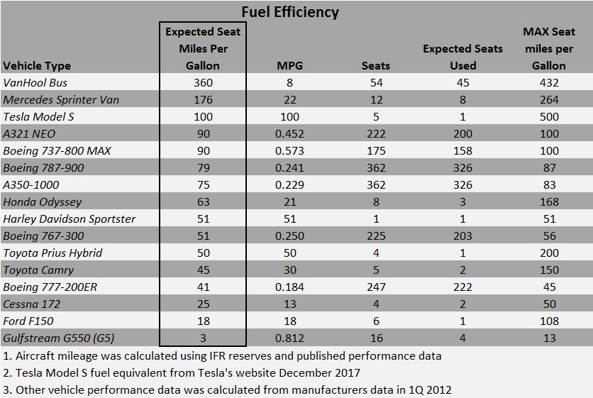
Automobile financials and operating statistics are similar to airlines on a smaller scale. They provide a framework for readers who are less familiar with airline data. Edmunds.com hosts a terrific tool that allows you to determine the “True Cost to Own” any vehicle with specific options you select. This feature provides a breakdown of the factors used to calculate ownership costs including: Depreciation, Taxes and Fees, Financing, Fuel, Insurance, Maintenance and Repairs. When you know the cost over a five year period, you can divide that by the number of miles you drive to find the Cost Per Mile. Edmunds’ formula for a top seller reveals that a 2012 Camry XLE will cost about $44,000 to own for five years and drive 75,000 miles. This means the owner will spend 59¢ per mile and this yield is an apples to apples comparison to the cost to fly.

The Edmunds values make sense especially when you compare them to the IRS mileage reimbursement rate currently 55.5¢ per mile.

iStock_000011195758XSmall

Let’s expand the personal auto example and add airline-like overhead. Consider the revenue per mile Yellow Taxi generates from customers in Chicago, Illinois. They use a two-part pricing model that combines an “access fee” $3.25 for the first 1/9th mile, with 20¢ for each 1/9th mile after that (ignore the other add-ons for this). A one mile ride costs $4.85, but that drops down to $2.41 per mile by the fifth mile. We already know that 55¢ is a reasonable estimate for Yellow Taxi’s operating cost, but that excludes a taxi license, communications expenses and the driver’s wages – it’s not a stretch to imagine that a taxi company’s expenses could top $1.00 per mile and double that when you consider mileage without a passenger. Drivers and taxi permits are major expenses that dramatically increase the cost to operate a taxi company in any city and “repositioning” costs are not insignificant and analogous to airlines’ costs for terminals and flight crews. Airlines can carry passengers far below the $2.00 per mile Taxi’s need, and they do it a thousand percent faster.

A refresher about the cost of personal transportation is a great segue into the world of airline finance and passenger yields. I’ve written about Form 41 data before, here, but want to point out a few excellent resources for airline data – the Global Airline Industry Program at MIT and their Airline Data Project. Additionally, Bill Swelbar’s blog, Swelblog, houses his opinions and analysis of current industry trends. Those sites along with select annual reports provided the data for my analysis.

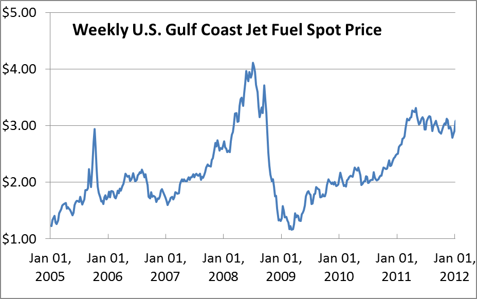
As fuel prices continue to have an outsized impact on airline operating expenses it’s important to understand what’s going on behind the scenes to make predictions about how prices may change in the future. I modeled an airline’s cost structure first; I’ll  describe a few assumptions through a discussion about aircraft operations that allowed me to calculate the variable and fully allocated costs of each seat mile.

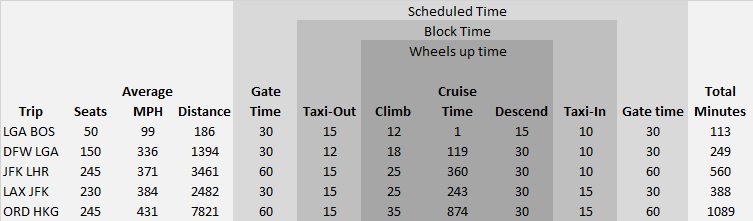
Begin with a short haul flight between Boston and LaGuardia, a 186 mile flight scheduled to operate over 113 minutes – only 31 minutes in the air. The balance of that time is used to taxi, park, load and unload. Short flights are burdened with higher costs for low aircraft utilization, gate expenses, ground handling and other costs that cannot be sprayed very far when you only have 186 miles to generate revenue. A fifty seat regional jet would create 9,300 Available Seat Miles. The flight will consume more than 230 gallons of Jet A priced at $2.80 per gallon and the crew salaries and benefits will be about $437. That gives us a variable cost near 11¢ per seat mile, while adding ownership costs, maintenance expenses, landing fees and other SG&A drives the cost per available seat mile up to around 37¢ per mile. The flight needs to generate more than $3,500 to break even.

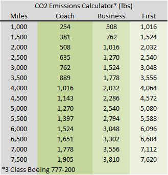
On the other end of this model: Chicago -> Hong Kong, with a three cabin Boeing 777-200 with generous cabin space and 245 passengers. Current fuel prices demand this flight generate more than $290,000 over the 7,800 miles between these two cities. The fuel expense alone is more than $100,000.

Gate time incurs agent expense and airport rent, while taxi time drives full pay for the cabin crew and burns fuel. Wheels-up time is actual flying time (high fuel burn). Block time is literally the sum of minutes the plane isn’t parked with wheel chock blocks in place. Each phase of the commercial operation has a different expense profile – the key takeaway is that flying is only a fraction of the cost. Click on the table for a detailed view.

block times

Now that you know something about the time demands based on stage length, you can combine that with expense ratios to predict how much revenue an airline must generate for each seat. Airline expenses are captured in the following categories in predictable ratios starting with fuel expenses (38% of revenue), crew costs (30%), aircraft ownership (10%), maintenance  (10%), SG&A (12% – includes airport leases, landing fees, and other selling, general and administrative). Fuel, Maintenance and Crew costs are cash expenses an airline can avoid when they reduce their schedules, but rent, leases, ownership and overhead will continue to be paid and those costs will rise in the short term as capacity declines.

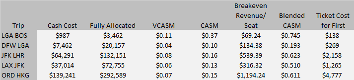
Break-even Yield data is available and fare information is easy to find – they can be used to construct a simple excel model to allow “goalseek” and other “what-if” scenario tools to apply simple rules and ratios to predict fares by cabin on a few routes. In the table below Cash Cost is the direct cost of operating the trip including crew salaries and benefits and fuel; VCASM means Variable Cost Per Available Seat Mile, CASM is the fully allocated Cost Per Available Seat Mile, blended CASM is the average Cost Per Available Seat Mile and combines costs for coach and other premium cabin seats.

trip costs

Predictive pricing models

Since fuel, crews and maintenance account for 70% of airlines’ total passenger revenue (at break-even margins), a leisure fare, marketed directly, is unlikely to sell for less than the variable cost of the seat; variable costs put a floor under the model’s leisure price (consolidator’s frequently have access to fares that just cover the fuel cost). I modeled a few variables to see how this assumption holds up and to determine if a simple model could predict industry pricing.

Divide fares into Leisure, Full Y (full fare coach), then F/J (domestic first, or business class), assume Leisure fares are 150% of the variable cost of fuel and crew expenses, then full Y is 300% of the leisure fare, and First class is double the full Y fare. Those assumptions produce results that look very similar to ticket prices customers are paying. Click for detail.

trip cost assumptions

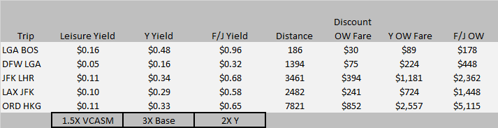
I changed the previous assumptions to take a deeper look at a three class, long haul trip. Starting with the $295,000 breakeven revenue required from passengers on a 245 seat flight to Hong Kong, I used “goalseek” to find the coach ticket price required if you assume Business Class is three times more than coach, and First Class is three times more than Business Class? The result is below.

Expected Fares by Cabin

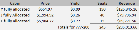
Business Class yield stands out – it’s very low compared to what most corporations are paying. Few customers actually pay 77¢ per mile in First Class, and a number of Coach passengers have a better price than shown above – that puts the burden squarely on the shoulders of the bread-and-butter Business Class travelers to make up revenue deficits in other cabins.

This back of the envelope analysis suggests that airlines that operate two-cabin aircraft on International routes actually have enhanced pricing power vs. airlines that operate three cabins. Two-cabin aircraft can dedicate more floorspace to business class and offer all travelers a price point below their three-class competition, while generating higher average revenue. Additionally, more business class seats allow an airline greater flexibility to upgrade coach customers and eliminate expectations that business class customers will be upgraded. Furthermore many airlines use the upgrade waterfall to eliminate overbookings in Coach by closing business class before it sells out, but First remains available. They protect oversales by moving travelers from business to first, and from coach to business. This reduces their First Class revenue and creates disappointment for top-tier, premium travelers when the waterfall doesn’t work out for them.

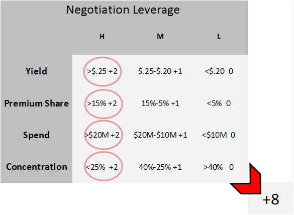
Both models offer you a framework to bin ticket prices by distance and cabin to help you develop your own cost ratios. That information can become the basis for a deeper analysis on your travelers’ buying patterns and will help uncover ways you can change behavior to drive cost savings and negotiate with suppliers.

For more articles about airline operating costs check out: The Secret Behind Airline Fuel Surcharges.

Aviation Travel Management

Navigate Bigger Airline Discounts

At first glance there’s no secret – airlines exchange higher share for better discounts. This seems easy enough, but there are a few things going on behind the scenes that smart corporations know and will use to their advantage to secure higher savings rates. Well managed travel programs are all the same. They have strong management teams and their policies and practices are aligned with business goals and traveler service. They generate “duty of Loyalty” – employees are driven to comply with policies because they receive excellent service; their travel management team is partnered with them to achieve each travelers business goals.

Airline customers come in all shapes and sizes, but a single number cannot tell the whole story. Airlines capture a lot of data, but four numbers standout to describe a customer: 1. Yield (average revenue per seat mile); 2.  Premium share (Percent of revenue above (below), the carriers fair market share (FMS)); 3. Total spend (revenue to airlines); 4. Customer concentration (Percent of traffic in markets the airline serves). This article will offer a simple scoring system corporate customers can use to determine how much leverage they may have in negotiations with their preferred airline suppliers.

Good airlines create detailed reports to measure the health and profitability of their corporate contracts. Major network carriers have 1,500 – 4,500 managed contracts in place, with another 5,000 – 30,000 agreements serviced through corporate loyalty programs (American – Business ExtrAA, United – PerksPlus, Delta – SkyBonus , Southwest – SWAbiz). Airlines would keep a close eye on trends that correlate the Net Effective Discount rates (NER) to the Yield and Revenue of a particular client. A rational and financially savvy sales team drives profitability higher by controlling NER’s  across industries or clients with similar spend patterns and size. Outliers are analyzed to determine if a particular team or sales person offered higher discounts than necessary to secure preferred carrier status. Additionally, sales support and analysis teams pay attention to specific customer issues.

As an example two consumer packaged goods companies have similar travel policies and total spend might, but warrant different discount levels based on their travelers’ compliance and support for their preferred carriers. Travel managers in the same industry would be disappointed if they expect equal treatment and ignore differences beyond size and policy compliance.

Airlines use sophisticated modeling and regression analysis to determine if their programs are working as designed. They produce graphs similar to the one below to share internally and use as a framework for strategy discussions about discounts and commissions.

Yield V Revenue

A simple scatter plot that contains data for the carrier’s top 100 clients might look like the graph above. The point on the far right depicts a corporate client that produced $35M, at a $.25 yield. It’s a large customer, but not an extraordinarily high yield. Notice there are several customers at or just above a $.10 yield. They are unlikley to receive industry leading discounts, but these customers can take steps to secure better discounts.

In the next graph the airline’s management team would look for a low slope angle and points clustered around the best-fit line. The slope indicates the relationship between yield and the customers’ discount levels. The lower the slope, the less sensitive to discounts higher yields are, while a high slope indicates that as yield rises, discounts are likely to increase rapidly too. Again, this is sample data, but it should give you an idea about how your program is viewed by your preferred vendors.  Additionally corporations without a contract should be able to achieve a savings rate at least as high as available through a loyalty program, so I’m always amazed to see NER’s below the 5% line (a typical valuation for SkyBonus or Business ExtrAA).

NER

Travel Managers should evaluate their program’s performance to establish realistic goals as they position their company and their Travel Management partner to launch an airline RFP. At this point, trust and respect between your team and the account managers and sales people at each supplier are vital for a smooth negotiation, but an honest appraisal can jumpstart the process and show you areas where your suppliers may expect work on your side to achieve your RFP goals.

Travel Managers who understand the airlines point of view and have strong influence over the qualities that matter will be rewarded.

Here’s a model I developed to determine how much leverage you have as you begin the negotiation process.

Leverage

Yield: Begin here. More than $.25 give your program two points. You have a travel policy that likely includes a healthy combination of domestic first class, some International flights (in business class), and a decent percentage of domestic coach-class, business fares. If you achieved this primarily because your headquarters office is in Boston, and your team flies to New York, Laguardia on the shuttle, exclude that data for this exercise. And for those companies that have a combined yield below $.20, don’t try too hard with the airlines, you’re already doing a great job – your travelers buy coach, and they book at least seven days out (no points). Everybody else, between $.20 – $.25 give yourself one point.

Premium Share: This is the one that separates well-managed programs from also rans. Does your travel team have the ability to influence travelers vendor choices? If you can answer yes – you have leverage. Do you enforce contracts to do the heavy lifting or do you need constant support from vendors each time a traveler finds a lower fare online or a checked-bag disappeared? Honesty here will uncover opportunities to drive incremental savings, but more of the same if the same means high maintenance then you will have a difficult negotiation. If you’re a bank or a movie studio and you give one of the legacy carriers an unbelievable share above their Fair Share or Seat Share in the LAX<>JFK market, then you get two points. If you’re based in Atlanta Delta earns all of your business, don’t get too excited, but I would still give you two points here (we’ll address this more in Concentration). For everyone else, use your judgement.

Spend: Are you a big hitter? Does your company spend more than $1BN each year on air travel (you know who you are), than give yourself two points – you’re big enough to dictate some terms. Even if you spend >$25MM and you have a well-managed program you’re likely to have more leverage than a smaller program.

Concentration: This one is more subjective than the others, but if more than half your spend originates or ends in a fortress hub, you should score yourself lower. A company with operations in New York, Los Angeles, Chicago, or any number of up-for-grabs cities will find that this will give you leverage to negotiate better terms with your vendors.

Leverage Scale

Here’s an example – If you combine low concentration, high premium share and high yield you will find yourself in a rare position and should expect industry leading discounts – even if you have a relatively low spend ($5MM). Carriers should fight over this business and the winners would expect to receive profitable traffic.

Leverage Score

The graph above depicts the best customer – one that can dictate terms and may be able to include “most favored” status in parts of their contracts. Any score above five would put a corporation in an excellent position as they negotiate with vendors. Four or below leaves room for improvement, but you should distinguish between values you can control and those you cannot. Total spend is something you’re unlikley to have influence over, but premium share is.

Travel Managers have a significant influence over the premium share variable, and travel policies are yield’s biggest drivers. Before any negotiation you should determine which avenue for savings would be more effective a policy change or carrier discounts. Remember four constituents should be delighted at the end of the process: travelers, corporations, airlines, and travel management partners.

Aviation Travel Management

Strategic Travel Managers Know Chemistry

Imagine a dashboard that could show you how much carbon dioxide your travelers generate every day. It’s actually a straight-forward problem and one I’ll try to solve for you today. Information about aviation fuel economy isn’t very accessible, but there are good clues and accurate data is easy to capture. Your frequent flyer account will keep track of the miles you’ve flown, but it’s impossible for most people to connect the dots to determine what their trips cost. Not in dollars, but in fuel, or in CO2 emissions. In a previous article I calculated “mileage” rates for aircraft by cabin and type of plane (single aisle or twin aisle) “The Secret Behind Airline Fuel Surcharges.”

In this report I’ll show you how much Carbon Dioxide a particular flight created and give you a quick, easy-to-use grid to provide travelers with information about the carbon footprint their choices make.

No need to remember anything about High School chemistry since I’ll lay out the chemistry and math to solve this problem.

First, Jet Fuel, or Jet A, contains a blend of different carbon-based molecules that combine with Oxygen to generate heat and pressure that jet engines convert to thrust. For simplicity, I’ll ignore the blend, and assume that “Octane”, a string-like molecule that contains a backbone with eight carbon atoms, and eighteen Hydrogen atoms along the sides and endcaps, is a good proxy for everything else in the gas tank. During the combustion reaction, each carbon atom combines with two Oxygen atoms to form Carbon Dioxide (CO2), while Hydrogen will also combine with Oxygen, but their marriage yields water (H20). The reaction balances when two Octane molecules react with twenty-five Oxygen molecules (O2) which contain two Oxygen atoms captured from the air passing through the engine. The exhaust product contains sixteen Carbon Dioxide molecules and eighteen water molecules. Here’s the equation: 2 C8H18 + 25 O2 -> 16 CO2 +18 H20.

This detail isn’t useful until we convert molecular weights and ratios into terms that people are more familiar with. In this case, jet fuel weighs about 6.5lbs per gallon, and that mass is 81% carbon. We already know that our Octane molecule will split to form water and CO2, but the result most people struggle with is the conversion to weight. Specifically, Oxygen is heavy, about a third heavier than Carbon, so when each Carbon atom combines with two Oxygen atoms, the resulting molecule, CO2 is four times heavier than the Carbon atom by itself. This means each gallon of jet fuel (6.5lbs) carried by the aircraft will combine with 23lbs of Oxygen from the air during the journey and turn into twenty pounds of CO2, and just over nine pounds of water!

How much CO2 does a Boeing 777-200 create on a flight between Chicago and Hong Kong? Let’s work through it – fuel is a liquid, and measured in gallons, but the exhaust is a gas, that’s why we use weight rather than volume to describe the output. I calculated the 777-200’s gas mileage in a previous post here. At .1836 miles per gallon, a 7,821 mile flight needs 42,000 gallons. The flight would generate 851,000lbs of CO2. That’s 30% more than the maximum takeoff weight on departure, including the plane, fuel, passengers and cargo. The table below contains a comparison among cabins and shows passengers, fuel burn and CO2 emissions.

CO2 per flight

Now that you have information about how to calculate the CO2 emissions for an entire flight, we need to add more information to break this down to the seat level. Previously I calculated the fuel burn per seat to provide a table that shows how much the fuel costs per mile for each cabin and at various price points for fuel. That’s a good starting point, but this time the data table will display how much CO2 an international flight would create for different distances and cabin. See below.

C02 per seat 777-200

The Boeing 777-200 offers a useful snapshot of the likely performance other aircraft could achieve. It’s a good benchmark because it’s currently in production and it’s flown on transatlantic, transpacific and intra-Asia flights.  However, the design requirements for long-haul international flying require twin aisles, more lavatories, large galleys, more storage space, life rafts and a host of other overhead not needed for shorter hops. These factors make it useful to perform a similar calculation to offer information about CO2 production from more efficient single aisle aircraft in use on short hauls and for domestic US flying. In this case, the 189 seat, all coach, 737-800.

CO2 per flight 737

A comparison between the 737 and 777 coach emissions level demonstrate that the smaller aircraft is more than 55% more fuel efficient when using numbers normalized for total seats. When you measure efficiency on a blended basis across all cabins the total difference is higher, that’s why it’s important to have separate tables. These tables offer you a quick resource to answer questions about the carbon footprint your travelers leave behind each trip. For more information about aircraft efficiency and comparisons among different modes of transportation, check out these posts about commercial aircraft fuel economy:

The Secret Behind Airline Fuel Surcharges

Boeing 737 vs. Toyota Prius (this might surprise you)

Aviation Travel Management

The Secret Behind Airline Fuel Surcharges

Travel Management is a tough business – we’re constantly challenged to explain complex systems and interactions among multiple vendors managed through a dozen systems. Vendors don’t make it easy. Airlines benefit when employees search out of policy for the lowest fares and inevitably compare a three day advance purchase against a twenty-one day AP offered on countless websites. Airlines have also monetized many benefits travelers took for granted three or four years ago. Government regulations have forced airlines to offer more transparent pricing which has led to improvements that protect travelers. Comparison shopping is more effective now since most fees and taxes must be disclosed up front.

Airlines suffered from unexpected fuel price spikes beginning in late 2005; since prices have remained volatile consumer awareness about the problem is very high. Airline marketers have learned how to transform their pain at the gas pump into revenue. Fuel prices routinely exceed labor as legacy airlines’ highest expense. Carriers add fuel surcharges aggressively to capture more revenue from each seat, and most travelers have no idea how much fuel their flights consume – this awareness gap has allowed carriers to regain pricing power.

Jet A spot prices

Data from the U.S. Department of Energy.

Fuel surcharges stand out as an especially onerous fee since they are ineligible for corporate discounts and can even exceed the base fare for some flights. Let’s face it, we’ve seen some big fuel surcharges in the past few years.

All of this has me wondering how much of the passenger’s fuel bill does the surcharge cover? Here’s the punchline: in many cases airline fuel surcharges exceed the cost of fuel needed to carry the passenger. That’s right – surcharges don’t just offset the incremental cost of higher fuel prices, they often exceed the total fuel bill. Customers and clients share a widespread belief that surcharges represent a fraction of the gas bill and most are surprised to learn the truth.

Surcharges have been expanding on domestic flights in the US, but are more commonplace on long-haul, International flights. They are usually applied by Origin and Destination without regard for the passenger’s ticketed cabin. The airlines have generally approached these surcharges as “one size fits all.”

Typical charges for Atlantic flights are $200 each way (between New York and London), while Pacific charges are more likely to be $400 per passenger each direction (between Chicago and Hong Kong).

The fee is not arbitrary, but I wanted to determine if coach passengers were being asked to subsidize the higher fuel costs required to move a passenger in Business Class or First Class? Essentially, is each seat carrying a burden relative to its density or floorspace requirement?

The key to this question is to calculate the fuel required for each seat then multiply that result by a particular airline’s average fuel expense (available in their annual reports). Airlines select aircraft for their operating costs and reliability. I’ve selected a Boeing 777-200 for this analysis since they are currently in production and can be found on routes across both the Atlantic and the Pacific. Although not as large as the Airbus A380 or Boeing 747-400, the 777 is much larger than some of the Boeing 767’s and 757’s in the Atlantic market. Next, a review of the interior configuration options at Boeing’s website demonstrates that a business class seat requires about twice as much space as a coach seat, and a first class seat requires double the amount for business class when you consider galleys and lavatories. Boeing reports the 777-200 aircraft could hold 440 seats in a coach class configuration; combined with other performance data I determined this plane can achieve 81 miles per gallon for each passenger in an all coach cabin. For these calculations our model aircraft holds 301 passengers, with 227 in coach, 58 in business class and 16 in first class. Normalizing the results as described above gives us the results displayed in the table below.

Fuel consumed V2

*$2.50 per gallon Jet A

The evidence is clear and I was surprised that fuel surcharges actually covered more than the fuel expense for the seat. Coach passengers may be subsidizing other passengers, but given the competitive fare environment it’s unlikely that $1,000 round trip fares to Asia are covering their fully allocated costs. The real story is that rising fuel expenses threaten to overwhelm carriers, and at least for now, travelers in premium cabins are catching a break from an unpredictable expense. This led to my next question, what do I do with this information?

Travel Managers must be able to plan. For this reason, well-known Industry forecasts are always in high demand and fuel is often featured as the largest unknown variable. Since fuel is a volatile input it makes sense to create a sensitivity table that shows us the per mile fuel expense to provide information that allows us to predict pricing action in a particular market. You can find current fuel price information at the US Department of Energy website. To use the table: 1. find the current fuel price in the left column; 2. select the price per mile rate that corresponds to the cabin your travel policy allows; 3. multiply the O&D distance for a specific market. You can find mileage information in your GDS, or at Flightaware.com. Flightaware is an excellent source for real-time operating statistics about most flights – consider adding it to your bookmarks.

Fuel Price data table v2

At $2.50 per gallon, the fuel expense works out to little more than 3.2¢ per mile for each coach seat, double that for business class and around 13¢ for a seat in first class. Although I ignored the revenue generated by cargo, which would reduce the cost burden on passengers, I also left out a load factor adjustment that would drive the per seat costs higher.

The next time someone asks you about a fuel surcharge, you’ll have everything you need to show them how reasonable the expense is – or isn’t.

If you’re interested about commercial aircraft fuel economy you should read another post from me:

Boeing 737 vs. Toyota Prius (this might surprise you)

Strategic Travel Managers Know Chemistry

Aviation Travel Management

You Won’t Believe This About Southwest Airlines.

You won’t believe this. I didn’t, and I’ve spent more than a decade staring at airline industry data, so maybe I’m the only one who didn’t see it coming. I’m going to show you something that runs counter to conventional wisdom and what we know and hear about at every ACTE conference or GBTA convention.

It’s well known that airlines operate on lean margins. They lose a lot of money during recessions and only break into double digit profits during the more profitable second and third quarters, but rarely on an annual basis. As airlines continue to squeeze more revenue from every seat the average load factors have increased to the point that the summer surge isn’t even noticeable. Airlines combine the 100% achieved on Sunday’s, Mondays, Thursdays, and Friday’s with the low 80’s on Tuesday, Wednesday and Saturday to achieve an 88% load factor for the month. Any hiccup or foul weather leads to hours of delays since there are so few spare seats to accommodate stranded passengers. Strong finance organizations are required to manage the complicated flows of people and capital. Young airlines act as if marketing will be in charge forever, but losses and maturity have a way of sobering investors, and eventually the CFO will take over.

Prior to deregulation in 1978, the Civil Aviation Board (CAB) approved routes, frequencies and pricing. The government intervention created monopolies that allowed airlines to provide the white glove service and fine dining that so many people describe as the golden age of air travel. This was a time when a 50% load factor was profitable and it was acceptable to smoke from takeoff to touchdown.  Filet was served on china and accompanied with real silverware. So which competitor exhibits this kind of pricing power today? Legacy carriers? The “low cost carriers?”

Every time Spirit, Jetblue, Southwest or Virgin America enter a market the local press wave banners announcing that low fares have finally arrived in Madison, Longview, or Springfield. How do they know?

The CAB reporting structure survived deregulation and data is still required monthly to be reported to the Department of Transportation on Form 41.  Every US carrier with scheduled operations and revenue greater than one billion dollars must submit the form.  It contains detailed information about the carrier’s financials and operating statistics.  The data provides a rich view about how the airlines operate their equipment and move passengers and cargo between every city pair they serve.  Here’s a link that describes the available data sets. You can create your own reports here.

A table I found recently was particularly interesting since it contained information about average departure airfares, taxes and fees for passengers departing the top 100 US airports. Since this table doesn’t distinguish between International and Domestic traffic it would be difficult to support meaningful decisions with this – this is not a comprehensive variance analysis, it’s just a back of the envelope look at four or five major airlines, so you should be cautious about using my conclusions to support your decisions. There is one section that contains information that looked meaningful – a comparison between average fares from 2001 and 2011. Out of curiosity I looked at the price changes for American’s hubs. Most showed a decrease – not too surprising given their financial condition. The data is in the table below (all tables are from BTS 3rd quarter 2011 vs 3Q 2001 – click the link above for the most recent values).

Hi contrast AA Hubs

Next I moved on to Delta’s hubs. They have a fortress hub in Atlanta (under pressure from several LCC’s), but their operations in Salt Lake City, Detroit, and Minneapolis are stronger. Overall a mixed result but they’ve demonstrated more staying power than American. How did that compare to United’s operations in Denver, San Francisco, Washington? Little to brag about here; see the charts below for details.

Delta Hubs

Here’s United (includes Continental – Houston and Newark).

United Hubs

It’s remarkable that Houston Bush was up 12% in a city that hosts a Southwest hub. Meanwhile Newark was up 1% in an extremely competitive metro area. Continental should be applauded for holding their own, especially when the Dallas Fort Worth area offers Continental a pure play to compare against (favorably). American hosts their fortress hub at DFW, while Southwest occupies Dallas Love Field, a situation very close to Houston, yet DFW average fares are down 5% while Houston Bush is up 12%. That’s a big difference in a business that counts margin in basis points. Who has pricing power? It’s not American or United in Chicago; and prices in Denver and San Francisco should scare any competitor away.

Southwest. Industry professionals describe them as the quintessential low cost carrier. This is a company that is proud of their small sales force, doesn’t allow seat assignments and only offers one cabin, and they’re pricing champions.

Southwest Hubs

Those are impressive results. The next time someone excludes Southwest from a list of industry leaders, remember, driving revenue is one of only two ways to increase profits (Profit=Revenue-Cost), and Southwest is terrific at growing revenue.

Aviation Featured Travel Management

Boeing 737 vs. Toyota Prius (this might surprise you)

We’re surrounded by advertising designed to convince us that some product or activity is green. Lighting, transportation, and hot water combine to form a significant portion of our daily energy consumption. Looking outside our homes, transportation is the largest controllable expense and energy user. Efficiency is tricky and subject to opinions and interpretation so I won’t create an absolute efficiency measurement here. Given Delta Airlines’ recent announcement that they will purchase an oil refinery to better manage their fuel costs let’s compare transportation on a relative basis and use empirical data to show us how different forms of getting around compare against one another?

I define efficiency as an amount of fuel required to move one person one mile (a passenger seat mile). On that basis we can rank Ford F150 pickup trucks against Global Express 550 corporate jets and a Toyota Prius against a motorcycle. Two additional ways we might look at this question are: 1. What’s the maximum efficiency a particular mode could achieve? 2. What’s the most likely efficiency a given mode will achieve?

Data and calculations have been updated to include a Tesla model S, and four airplanes that entered service since this was originally published in 2012. The new list includes the 737MAX, Airbus A321 NEO (New Engine Option), a Boeing 787-900, and the Airbus A350-900. When people are asked which is more efficient, a Boeing 737 or a Toyota Prius, most make a common error and allow speed to affect their judgment about efficiency. The answer depends on the number of full seats. In fact, a 737 filled with a typical number of passengers is more efficient than a Prius with a single occupant. The Prius excels when you start to pack people into it, but most respondents assume that modern jet aircraft couldn’t compete against a hybrid car. This exercise showcases how efficient certain vehicles are. Our runaway winner is the world’s fleet of large tour busses. Operated at capacity these vehicles can move one person between Los Angeles and San Francisco with one gallon of diesel fuel, while a 737 will consume five gallons, and a loaded Prius needs more than two gallons per seat.

The other end of this spectrum is interesting too. How does traveling in First Class by commercial carrier compare to the fuel ‘cost’ required for an individual to travel onboard a private jet? Before we answer this we need to calculate the fuel burn for a first class seat. Boeing reports the 777-200 aircraft could hold 440 seats in a coach class configuration, so we know this plane can achieve 81 miles per gallon for each passenger. Assume that Business Class seats use twice as much fuel as a seat in coach, and First Class seats consume four times more fuel than the average seat in Coach, then for the Boeing 777 we would expect to achieve 20 miles per gallon for each First Class passenger.  Compare that to the 13 miles per gallon each seat could generate in a Gulfstream Global Express 550 if every seat was full! Even filling half the seats in the plane would require a fuel burn more than three times higher than consumed by a First class seat on a Boeing 777-200ER and that ignores the frequent ‘repositioning’ flights private jet travel requires.

This table normalizes fuel efficiency based on passenger seat miles. In this example, a Prius with four people would generate four passenger seat miles for every mile driven, while a Boeing 737-800 could generate up to 175 passenger seat miles for each mile flown.

This exercise also points out a paradox in aircraft design – a single aisle Boeing 737-800 is nearly twice as efficient as the larger, double-aisle Boeing 777-200ER. The design requirements for long-haul international flying require more lavatories, large galleys, more storage space, life rafts and a host of other overhead not needed for shorter hops. This paradox creates an opportunity for shorter stage long-haul flying as fuel costs continue to rise. I’ve already shown that absolute fuel burn does not correlate to efficiency the way seating capacity does. Commercial aircraft can move many people very rapidly, and they do it at least as efficiently as cars, and advanced aircraft designs like the 787 Dreamliner, and A350-900 are closing the gap with their single-aisle peers. Motorcycles and minivans are great for moving one or a few people, but it’s very clear that technology scaled for personal transportation doesn’t beat mass transit today. Buses and mini-buses continue to shine in a world where liquid fuels are scarce and expensive and it will be interesting to watch how efficiency demands will shape international and domestic travel in the coming decades.

If you’re interested about commercial aircraft fuel economy you should check out these posts:

The Secret Behind Airline Fuel Surcharges.

Strategic Travel Managers Know Chemistry

Aviation Featured Travel Management